Monthly Archives: January 2010

Soft Focus on Liberty

Liberty of London, Great Marlborough Street, London

The most prominent fashion trend for this spring is soft and feminine with dusky pastel colours. Liberty’s window scheme compliments this trend with pastels and floral wallpaper, flower bundles made of paper tissue, beautiful Stella McCartney dresses, dreamy mannequins, and big grey big hair!

The dreamy aesthetic of photographer Sarah Moon was the inspiration for the scheme. Maxine Groucutt, the head of visual identity at the department store elaborates: “When I look at her photographs of women I  feel like I have stumbled into a private moment. Somehow that moment doesn’t feel awkward or uncomfortable, it’s more about witnessing something you should have seen.”

I love the pose and the mannequins expression, it’s like she is escaping something but stuck at the same time. Great idea to stick the hair to the wall. Hair is the best styling statement throughout the series.

This almost happened to me when I was curling my hair the other week: my hair got caught in this curling brush, I couldn’t get it off it, and had to cut myself free!! I was absolutely devastated.. But I am sure this is not accidental.. It’s either about women self-harming themselves OR it’s ment to be liberating, like setting yourself free.  What do you guys think? Am I digging too deep here?

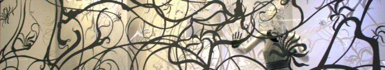
Detail of the above window.

Branding letters cut out of newspaper.

Paint splatters and the actual cans left in the window as props.

This is probably my favorite of the series, love the crazy hair, the dresses and the fabric flowers ( which I will learn how to make- one day).

I doubt I am the only one who is investing in nudes, greys and pastels this spring. Feeling romantic now!

About these ads

The Fourth Floor at Harvey Nichols

Harvey Nichols, Knightsbridge

Harvey Nichols is launching a whole new fashion concept on the 25th of January. It will be on the 4th floor and will house accessories and lifestyle products as well as fashion. There you will find emerging designers like Peter Pilotto and established names like Marc by Marc Jacobs. It will definitely be worth checking out as they’re trying a new way of merchandising, and will host exhibitions and collaborate with the designers. (source: harveynichols.com)

The windows remind me of modernism with an eighties twist. It’s really cool the way the message ’4th floor’ is written on different dimensions on the props.

Designer Spring Previews

Sloane Street, London

Luxury brands are promoting their spring/summer lines already and hurrah the sales are almost over, so there will be plenty of interesting windows to report on.  Here is a preview of what I have found on my travels.

Paint splattered trend still going strong at McQueen, Bond Street. I like the paint in the mannequins’ faces and the skeleton mannequin in pretty cool. McQueen has the most creative fashion shows with almost creepy models, music and quirky stage sets. Love it!

Chanel, Sloane Street. Chanel’s nautical collection with a Venice backdrop. I want the  shoe boots! Seems like this trend comes back every summer.

D&G, Bond Street. Animal print anyone?

Giorgio Armani, Bond Street. Pastels are going to be big again this summer.

Louis Vuitton, Bond Street. I think these windows are really cool, they’re dark with spotlights on these birdcages, that have LV accessories in them. Check out the little birds as well.

Fendi, Sloane Street. I had to show you this ladybird range because the bag is not just on my wish list, but also seems to inspire the idea behind the spots theme running through the windows.

Paul & Joe, Sloane Street

Matthew Williamson, Bruton Street. I love this window, it’s very transitional between winter and summer seasons with all the snow, the summer dresses and the beautiful birds and butterflies. I am expecting very, very beautiful things to come from Williamson this summer so stay tuned.

4 Stars Sales

Knightsbridge, London

It was snowing last night and to me London looked great. It’s funny how people have digged out their Hunter wellies. Now there are two occasions when they can be used as a fashion statement:  summer festivals and January snow. Some shops are still in sale, but a few are already showing spring collections. Here are some more examples of the sale windows.

I wonder why they didn’t give themselves five stars? The mannequins are like showgirls, so I understand the styling. Sometimes if you accessorize lingerie too much it can look a little dodgy.. I wonder what colour they’re going for Valentines Day as they’re already doing pink?

Thomas Pink.

Marie Chantal had sale written across four shopping bags, but it really wasn’t that effective because the letters are very small, and the bags kept spinning around so that you wouldn’t even see them that well.

Harrods sale message is always: ‘There is only one sale’.  Some of their windows were still in Christmas mode, but all the main ones covered with vinyl. The sale ends the 23rd, so can’t wait to see their first Spring scheme.

The sales are on

Various shops, Bond Street, Regent Street, London

Red, red, red and more red. Sale time is  great for shoppers but not so exciting for window displays. Most shops just use banners, but there are other ways to say SALE like big 3D letters (fairly popular), on a shopping bag (ground breaking..) or just using lots of red.

Fenwick on Bond Street. I like the way the models are interacting with the sale message.

Festive sale letters at Jaeger.

Sale message mixed in with other catchy foamex words at Nokia.

Light bulb letters at FCUK. They used the same light boards for their Christmas scheme (which I unfortunately have no pictures of, sorry), and actually started their sale way before Christmas (I know this because I’m sad lol).

Kurt Geiger, Regent Street. Another light bulb neon sign, who’s copying who, hah?

Cos, Regent street. Wooden letters, and not even red. What is going on??

Neon light sign at Selfridges. Most of the windows were vinyled with a simple sale message. The neon lights are definitely a trend this winter!

Sale message on an oversized Aquascutum label. I like the stock they have chosen: red, white and black macs – it’s simple and effective.

Diesel, Bond Street. They have done something a bit different, covered furniture with white cloths that say sale in ‘creepy’ letters. Reminds me of furniture covered like this in unoccupied houses. Like it.

Esprit, Regent Street decided to cover their mannequins with red stretchy fabric. Quite funny.

This is Mulberry on Bond Street. It doesn’t actually say sale anywhere so I might be wrong assuming that the red colour here means sale.

But use RED and people will wonder if the store is in sale and might just walk in.